Early geography lessons should try to break some misleading habits of thought about the world and its orientation. Principal among these is the idea that north is “up” and south is “down,” and that as a result the North Pole is somehow “above” the South Pole.
Such notions are understandable, as almost all world maps place north at the top and south at the bottom while globes are almost always oriented in the same way. But they are also nonsensical. “Up” and “down” are defined by the gravity of the planet, with “down” always pointing to the center of the Earth. The South Pole is thus as far “up” – or away from the center of the Earth – as the North Pole [1]. Orienting maps and globes with the north at top is thus a mere convention, with no logical basis. There is nothing wrong with using such conventions, which are actually highly useful – as long we remember what they are. But we don’t always do so. Instead, we often come to regard the placement of north at the top as somehow natural or correct. As a result, most of us are thus taken aback when we see a supposedly “upside down” map or globe.
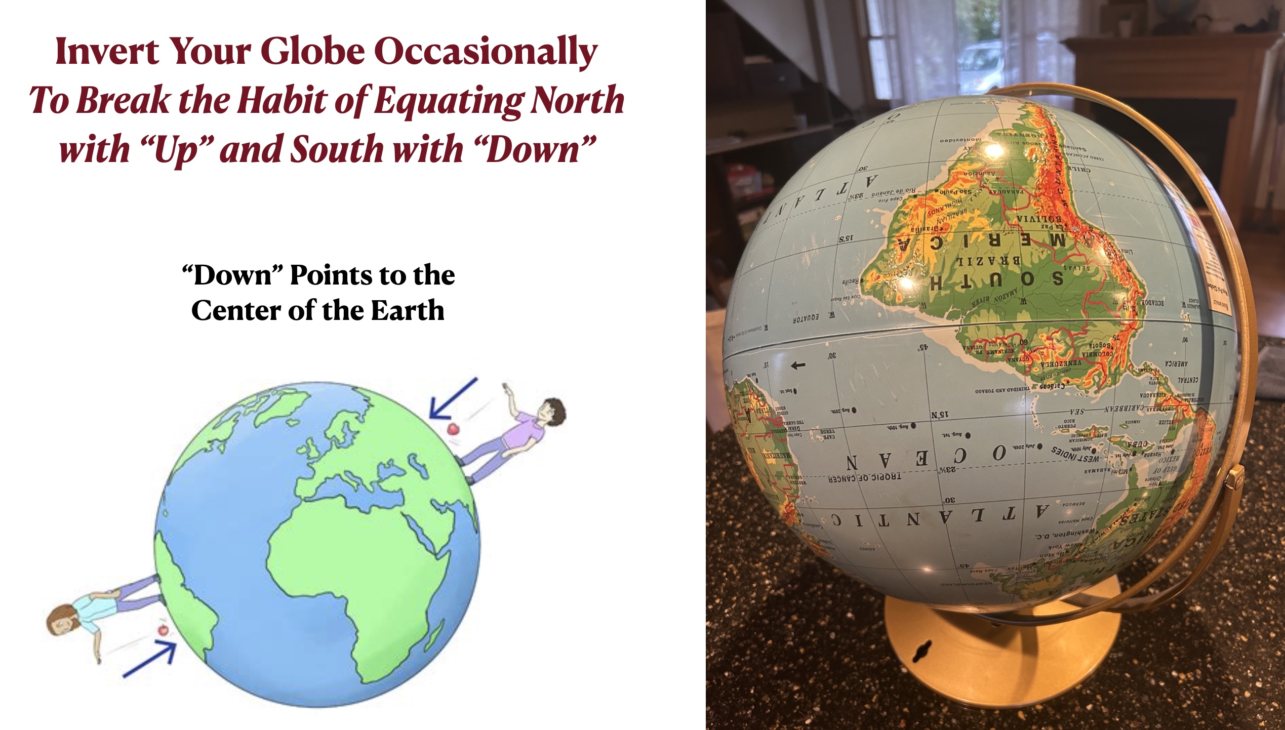
Fortunately, most globes can be inverted. It is useful to put them in this position occasionally, mostly to drive home the point that the Earth should not be thought of in “up” and “down” or “top” or “bottom” terms. Putting the South Pole at the top of the globe over also makes it easier to see the southerly parts of the Southern Hemisphere, which are often partially hidden by the rest of the globe. Even on world maps, we tend to focus more on the top than on the bottom, which does a slight injustice to the Southern Hemisphere. For precisely this reason, some world maps made in Australia and other Southern-Hemisphere countries place south at the top.
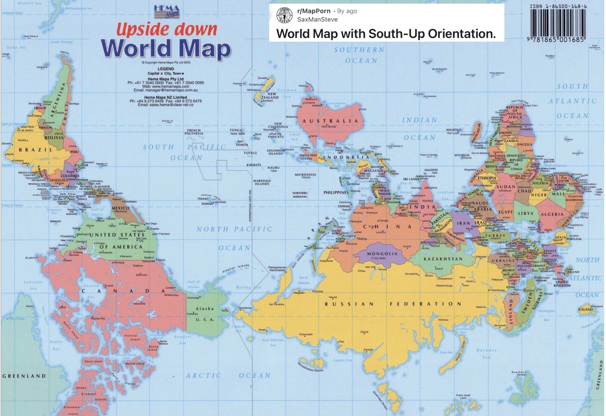
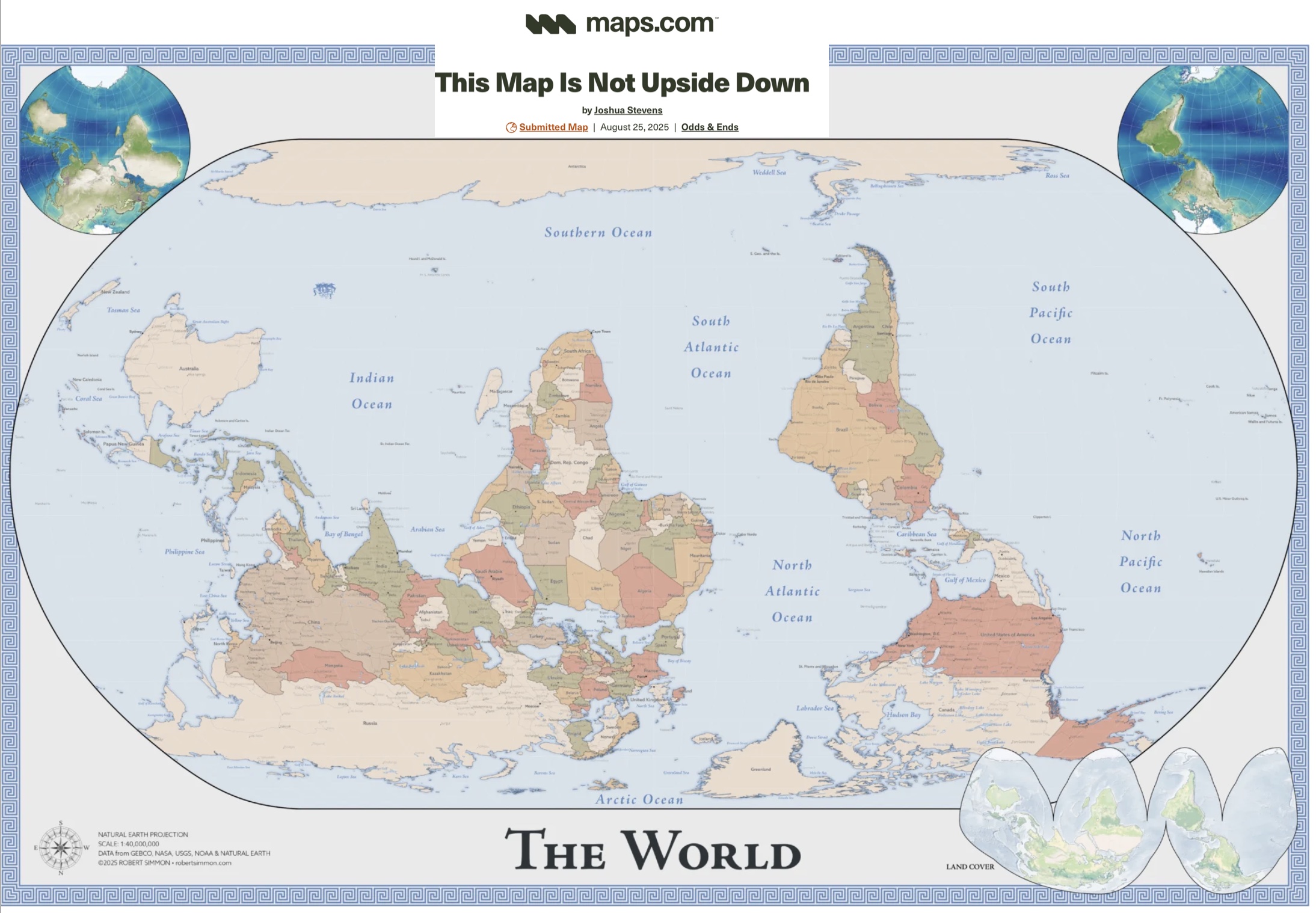
In doing a quick image search for such maps, however, I was disappointed at how few I could find. Most of the ones that I did find were disappointing. The first map below, for example, uses the unsuitable Mercator projection. It is also labeled “Upside down World Map,” undermining my point. But the second map, by Joshua Stevens,” is brilliant. As its author notes, it is not upside down. I also like the projection and the three inset maps [2].
[1]. Actually, the South Pole can be framed as “higher” than the North Pole. If you reach it, you will be standing on top of 9,000 feet of ice, whereas the North Pole is essentially at sea level.
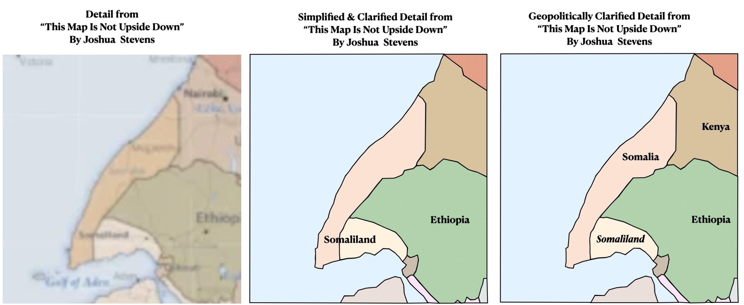
[2]. This map does have a few geopolitical errors or perhaps mere oddities, depending on how the author conceptualizes them. Most striking is its unusual treatment of Somalia. The author differentiates by color the internationally recognized but largely non-functional state of Somalia from the non-internationally recognized but functional state of Somaliland. I have no problem whatsoever with such a geopolitical framing. But the label “Somaliland” extends across the de facto border between the two states while a label for “Somalia” does not appear. The third of the three maps posted shows a clearer framing of this important but fraught issue, with the label “Somaliland” placed in italics to indicate that it is not an internationally recognized state.